User research project for pricing and sign up
PeopleMatter investigated and pursued a "self-start" sales process whereby a user could sign up, pay for and begin using the product entirely on their own. The pricing page project aimed to turn the corporate website into the sales team to handle the credit card transaction for a new customer signing up as well as the provisioning of a new customer.
Problem
All new business is closed using sales and implementation teams. A large segment in the smaller end of the market is left untouched because it is not cost-effective to puruse.
Solution
Created a simple workflow that customers of various sizes can use to educate themselves about the product, self-select the tier that's right for them, purchase and complete the setup process.
My role
- Planning/Wireframing
- Design
- User testing
- Project management
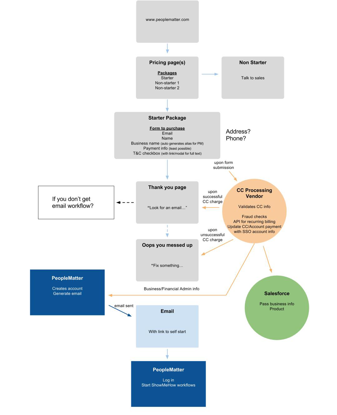
I created this user and data path file to help the team understand the various systems and steps that we were trying to integrate.
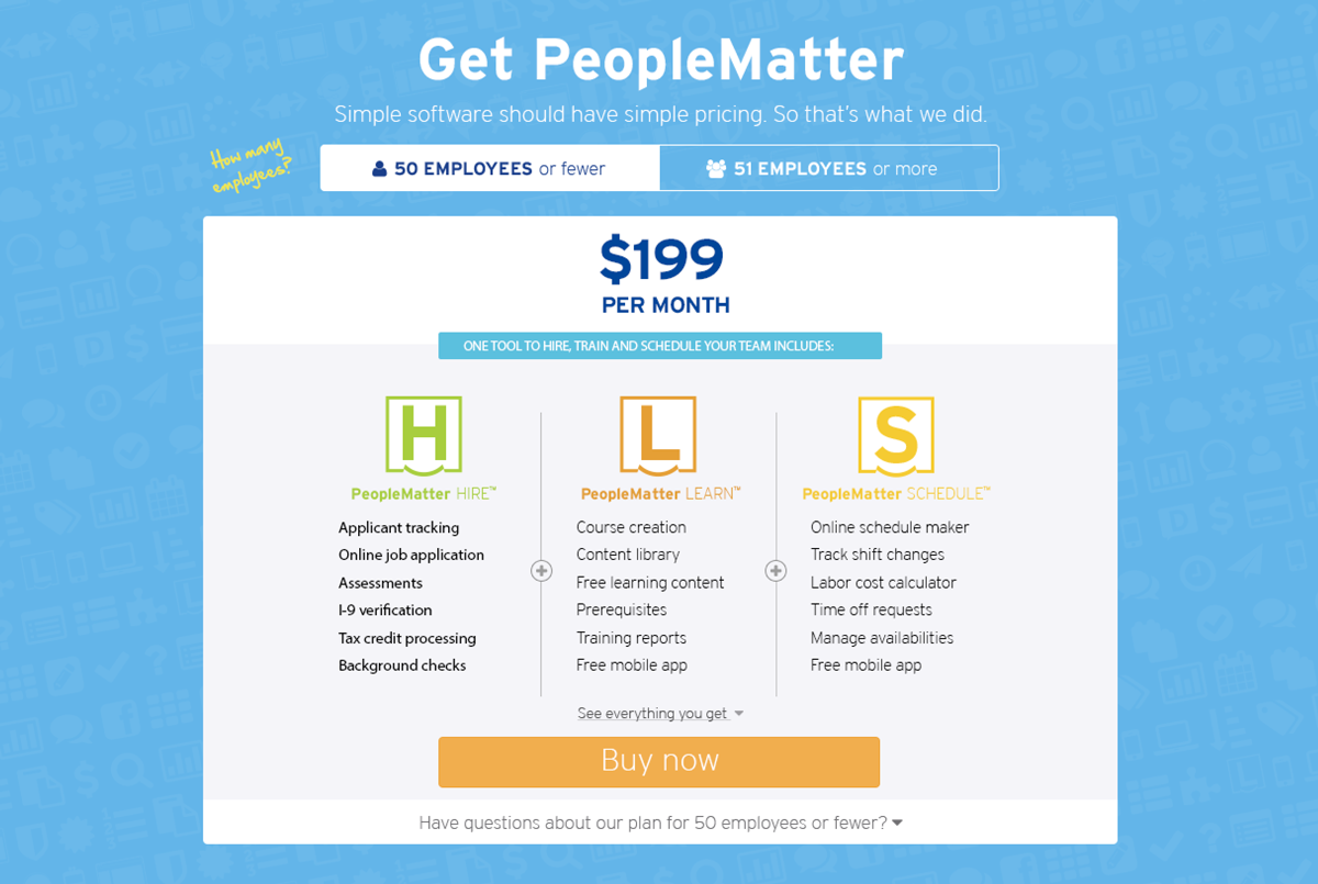
This is one of the early designs I came up with for our pricing page. At one point during the project we considered a flat rate price, but then opted for a tiered structure. So it was back to the drawing board.

This design fit better with what most pricing pages looked like with a card-like layout. We had realized we needed to give some more information about what was included in each product to help reinforce the decision to buy PeopleMatter.
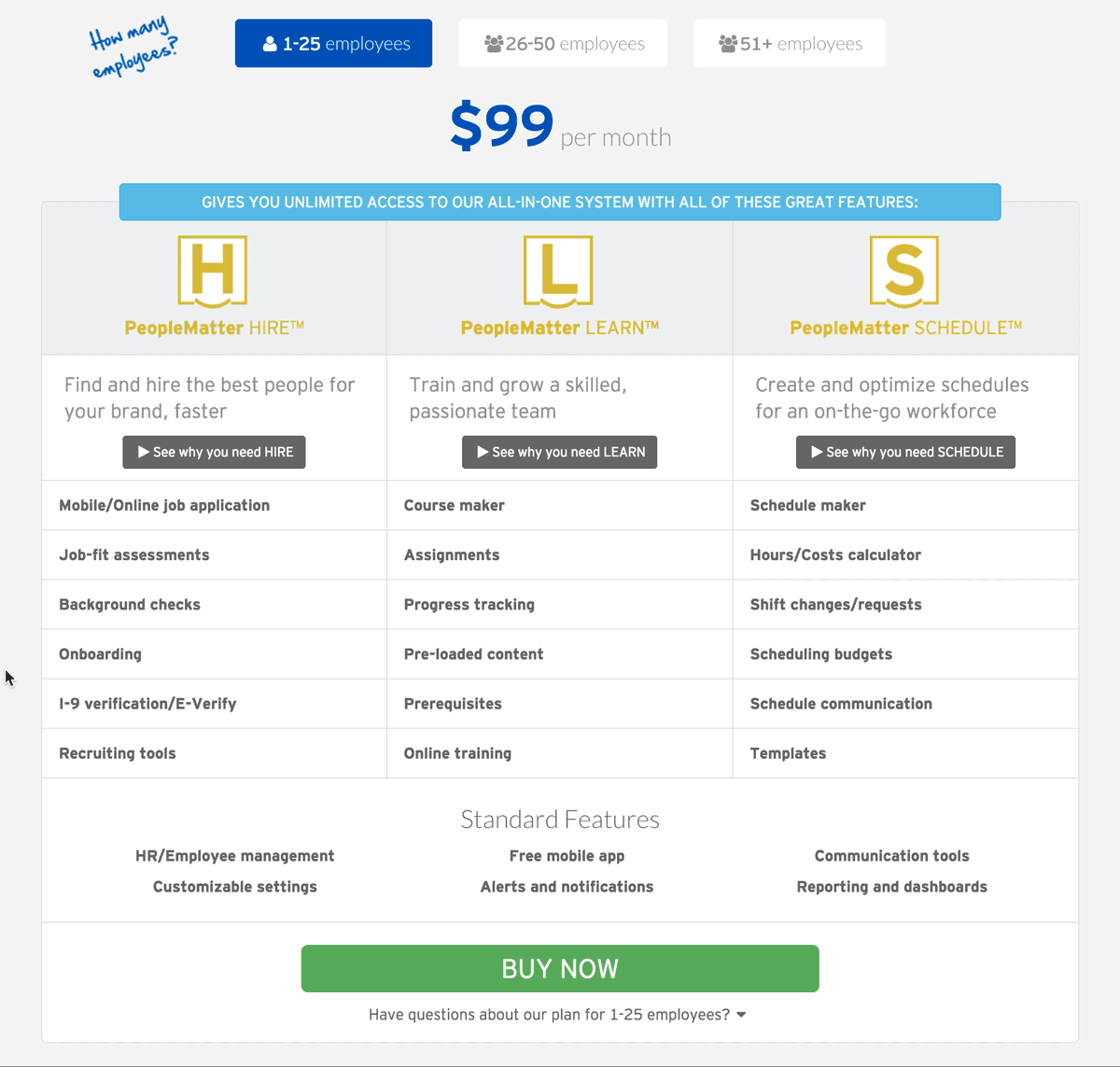
During some user testing of the previous design we saw something interesting. Potential buyers weren't sure what all of the terms under each product meant and would click on or hover over each item in an attempt to find out more. I thought adding rollover tooltips would be an elegant way to inform more, while also keeping the page clean and simple looking so as not to overwhelm someone during a purchasing decision.
Ultimately, the decsion was made not to pursuse an online "self-start" sales process, so unfortunately there's no page to link to.