Journey design for digital retirement advice
Prior to this online retirement advice and planning service being launched, Standard Life only offered financial advice to wealthier customers, leaving the majority of customers without access good financial advice at a crucial point of their lives: retirement.
Problem
Long-term customers of Standard Life, a UK-based pension provider, were transferring their money from Standard Life when they were at the point of retirement. Not only was this a negative for the business losing customers, but in most cases customers were not aware of the important tax considerations that could make a massive difference in how long their money lasted in retirement.
Solution
Designed, tested and iterated on an end-to-end journey allowing customers to say what types of money they had and when they wanted to retire and were presented with the most tax-efficient income number they could expect to achieve in retirement.
My role
- User research
- Usability testing
- Design
- Front-end development
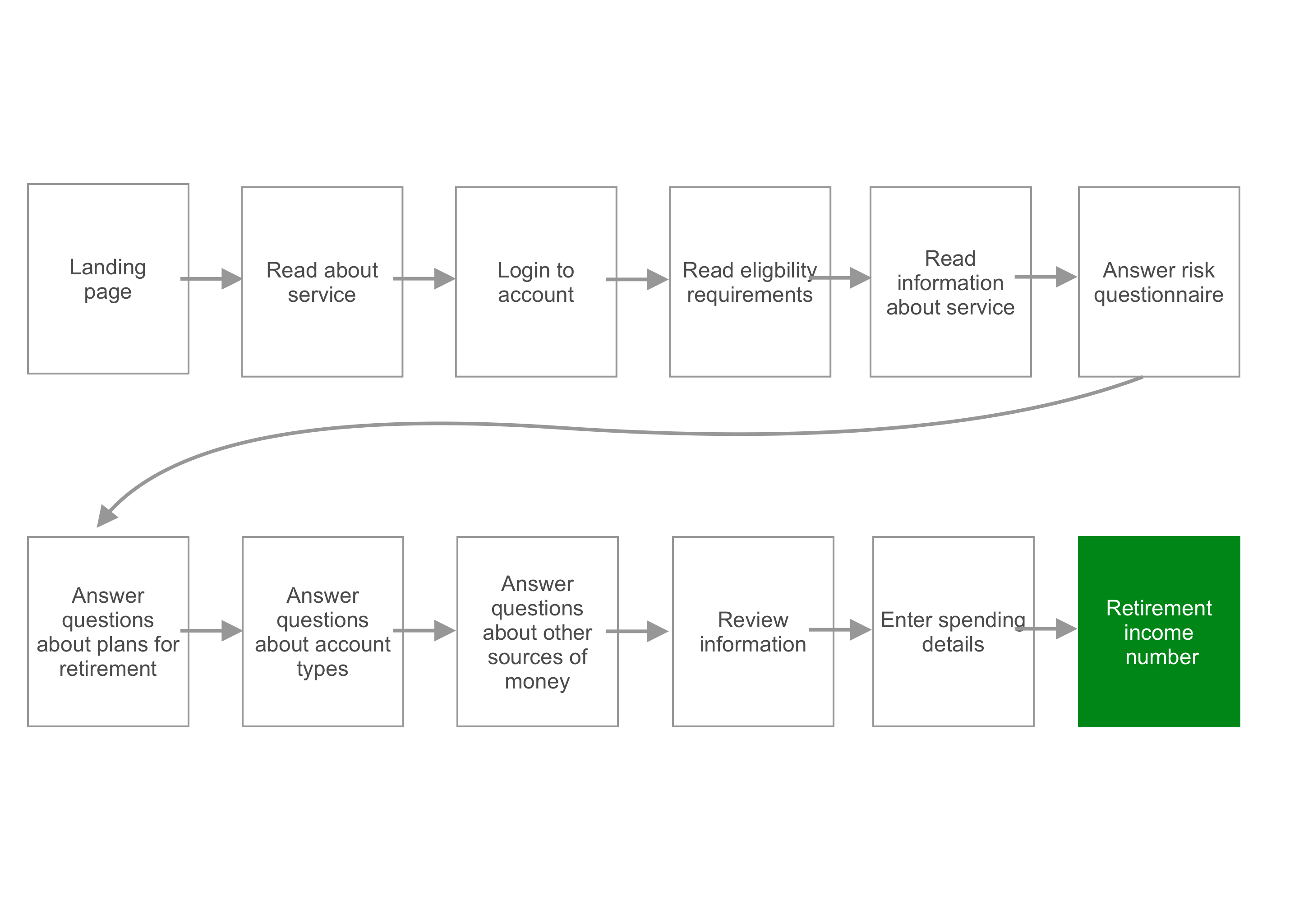
The user journey we had
We started with a journey that made customers click 6 times (!) before they ever started entering any data — let alone get any valuable information from the service. We also had a massive drop off rate — 90% — in the third step by forcing customers to login right away.
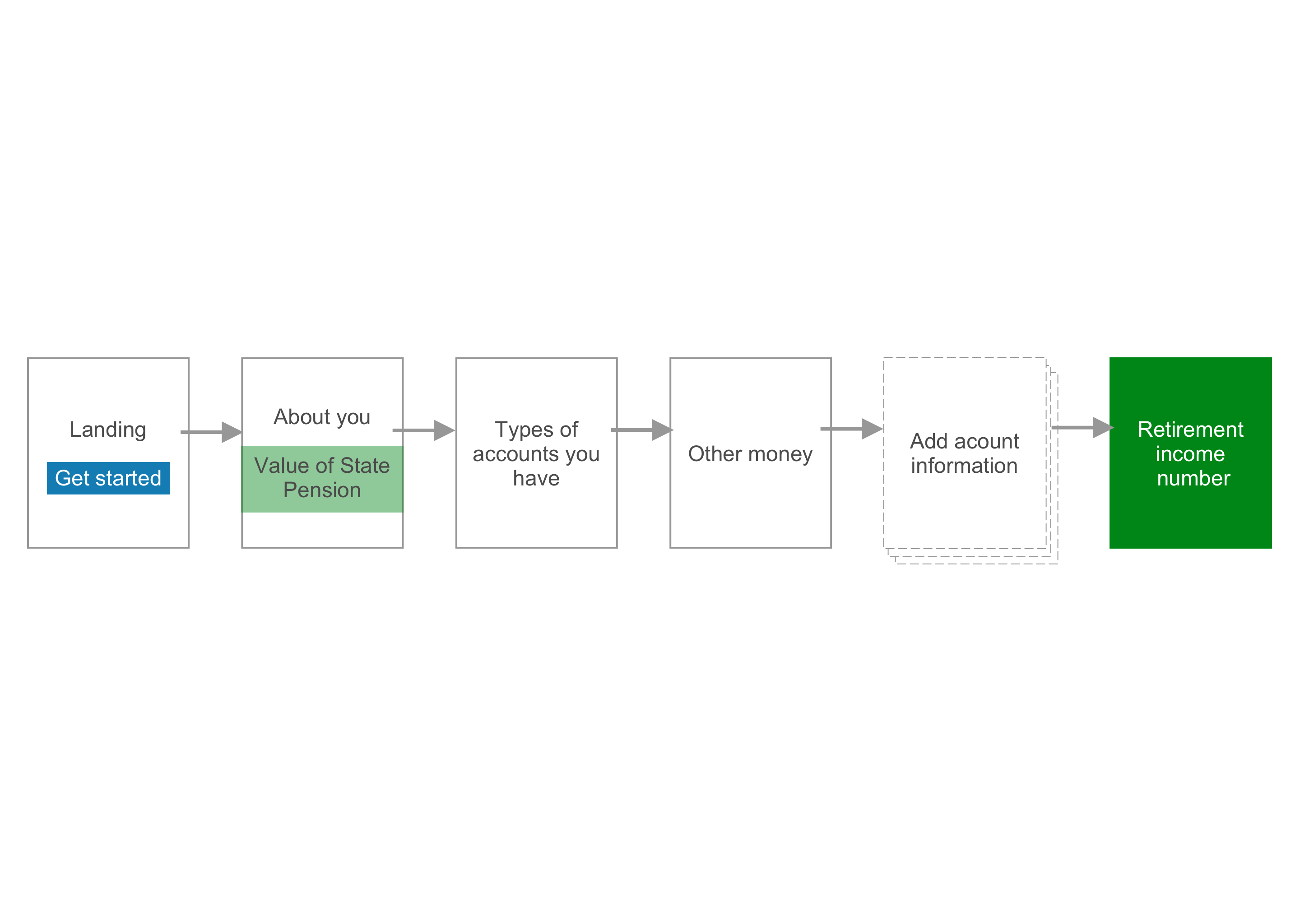
The user journey we deserved
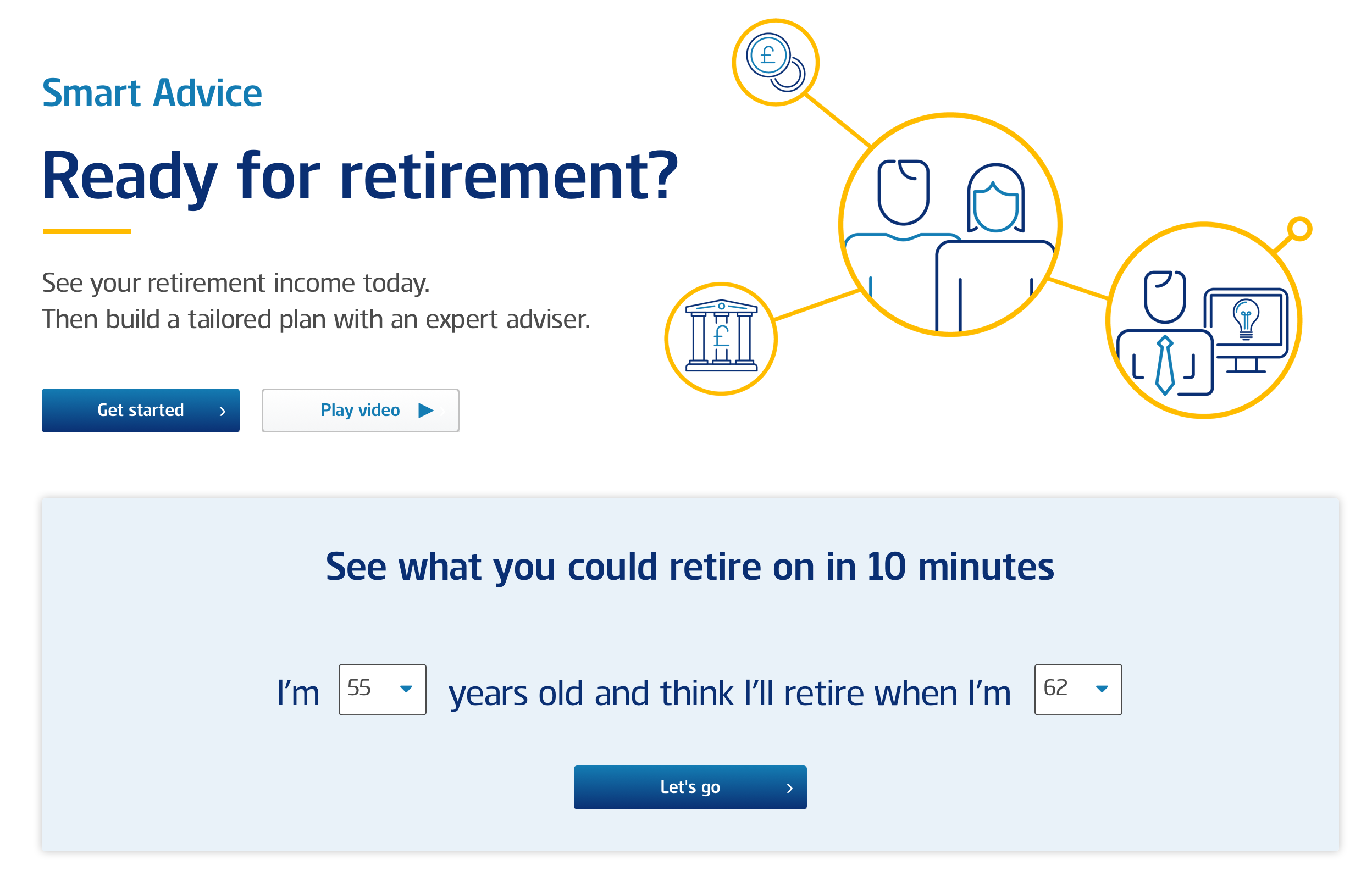
The focus of the "after" journey which we dubbed "Quick Start" was to let the customer get started right from the landing page, get value back as soon as possible and remove pain points that could cause them to drop out.
Landing page
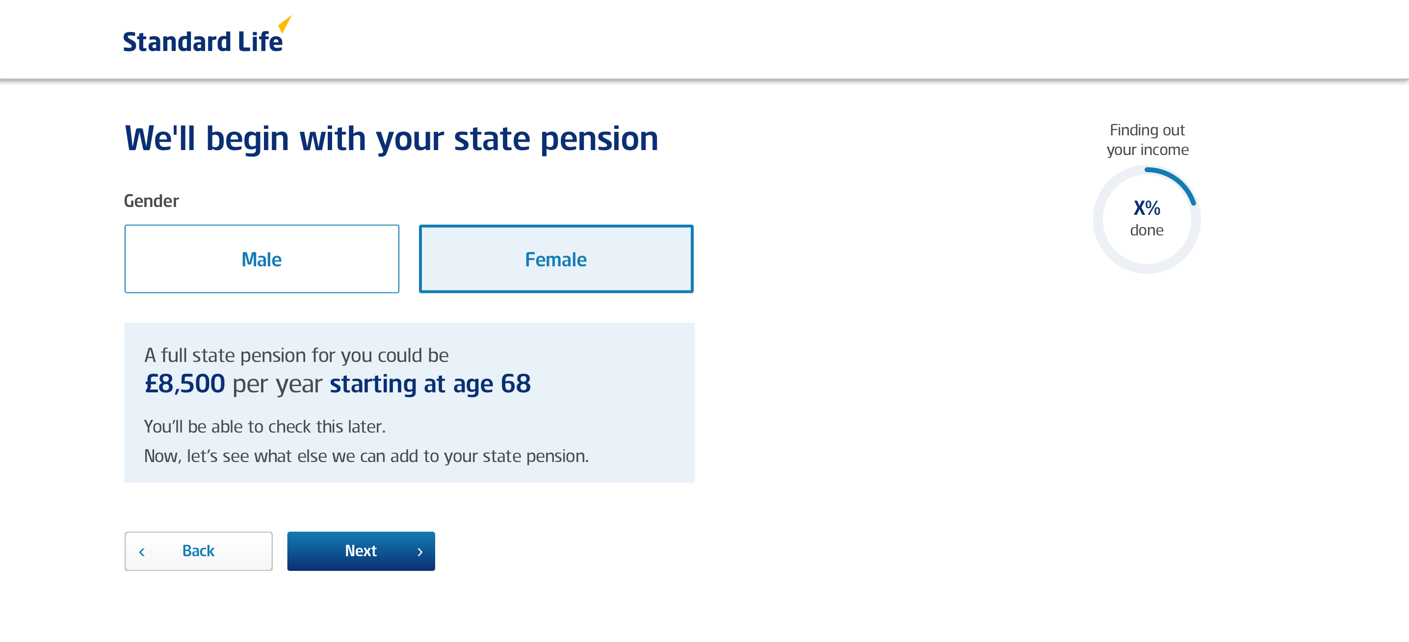
By asking just for their current age to get started, we were attempting to remove any hesitation about giving this tool a try.
We wanted to imply that this was a simple process that would give them real value in under 10 minutes and wasn't going to take long.
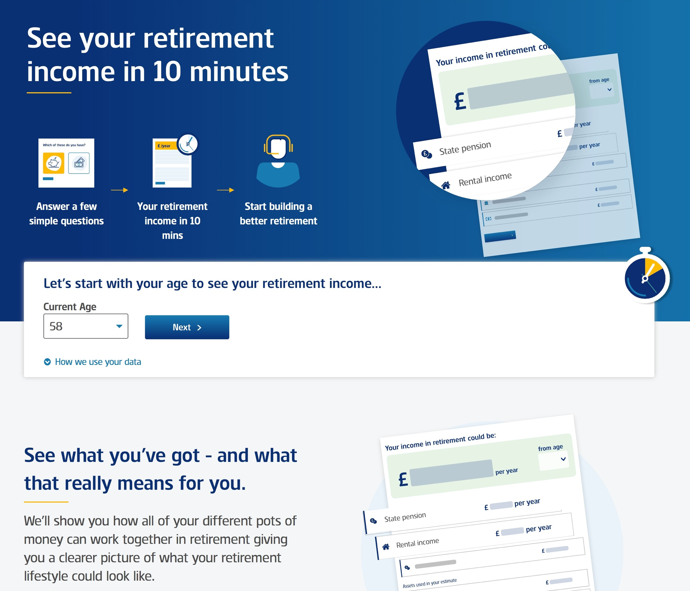
Value exchange
We realized from testing that many people had no idea how much they could expect to receive from their state pension (social security) that would make up the foundation for many customers' retirement income. This was an easy thing for us to add that provided real value on the second page of the journey.
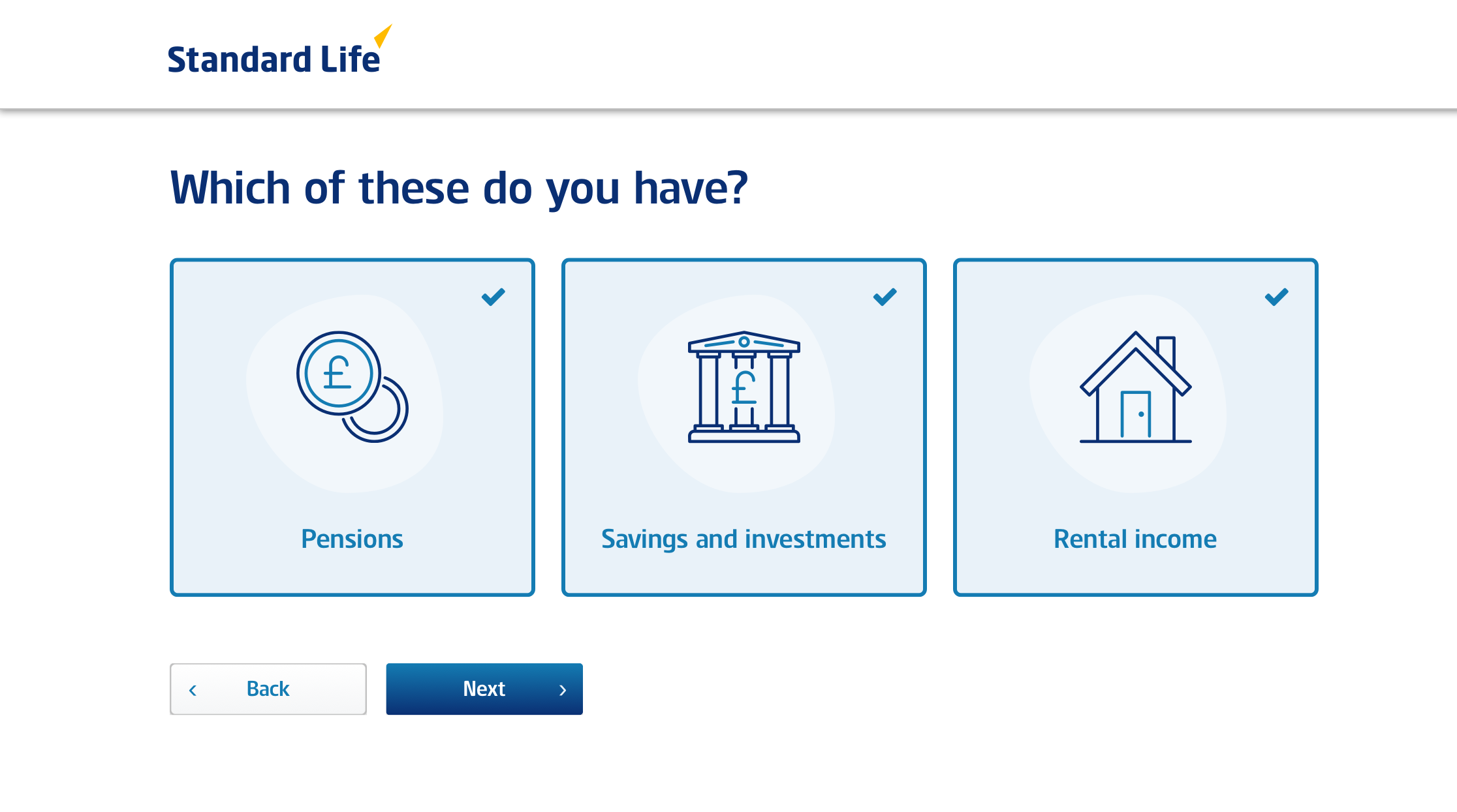
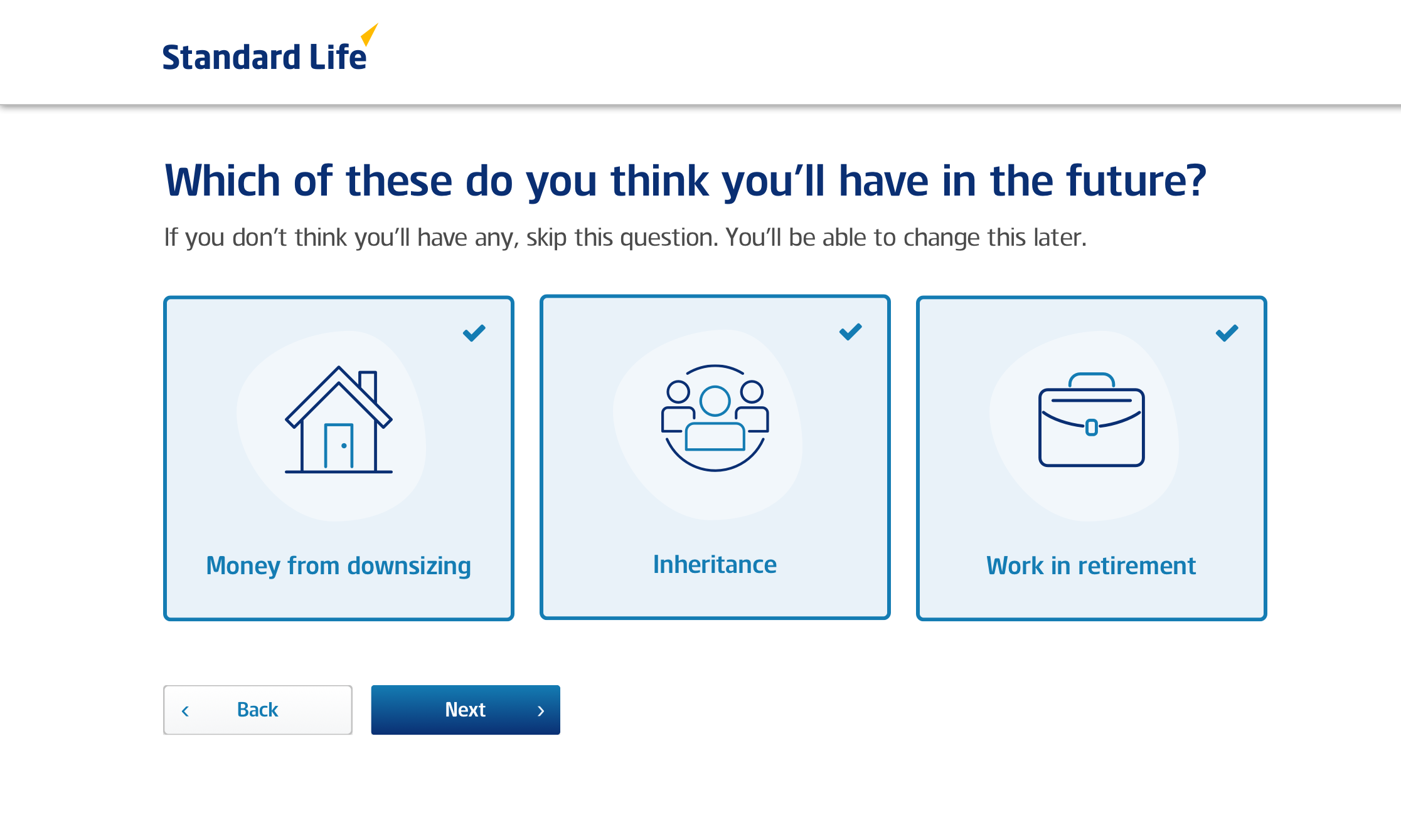
Big touch targets, simplified layout
Earlier designs we had for these pages where users selected the types of accounts had two major problems that came out in usability testing with our target users who were 55–65:
- Sizes of the select buttons made it hard to select with a mouse because of the precision required to hit the target
- We asked for an exact value of their account causing unneccessary back and forth between the keyboard and mouse (many users were not touch typers so actually had to look down from the screen to the keyboard).
I thought that grouping all the answers a user could give using only a mouse and then all the answers that required keyboard entry would help keep the user focused and keep the journey feeling quick and simple.
Session recordings and future usability testing proved my assumption correct with no users struggling to click on items or having to look up and down from the screen.
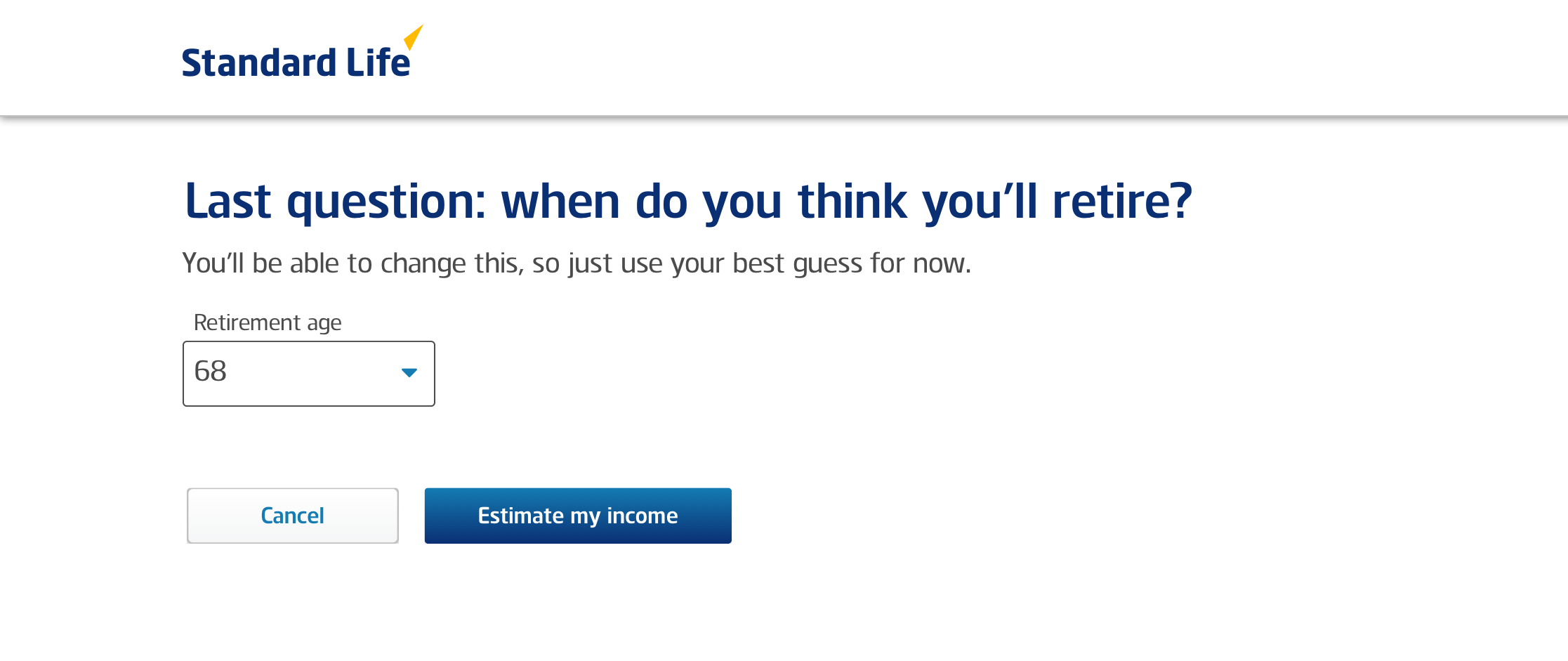
A little bit of context makes a big difference
Prior to "Quick Start" we asked customers their current age and the age they wanted to retire before they were allowed to start the journey.
We noticed a lot of users weren't sure when they wanted to retire and just wanted to use this tool to get an idea of what retirement could look like for them.
By placing this question here, right before the big reveal of their potential income in retirement, helped put the age in context and helped push users to select a more realistic number.
Since we knew their current age, we simply defaulted the retirement age to their age +1 year and allowed them to use that or change it.
Clicking 'Estimate my income' then triggered the spinner component I helped code and implement to provide further context to what exactly was happening behind the scenes.
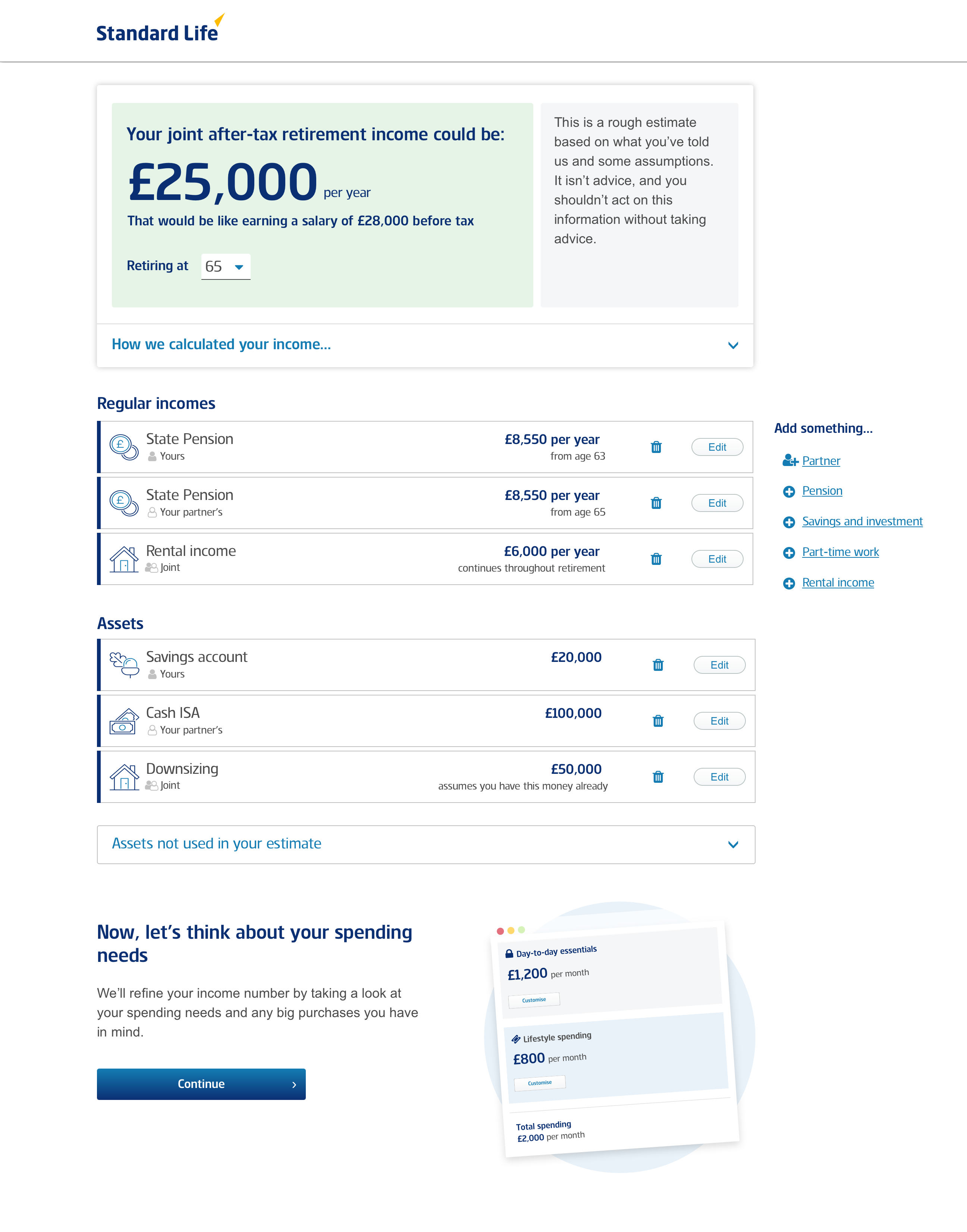
Let's break this down…
The level of financial literacy varied widely among our users and we were starting to introduce a lot concepts all at once like assets, incomes, regular incomes, pre-tax, post-tax, money left over.
The information hierarchy was tricky to get right, but we got to a good place by starting with one big number — the income — and relating all other numbers to it.
It was only natural that customer had an instant reaction to the number they were presented with (i.e. that's enough or that's not enough for me to live on) so we only had one chance to make a good impression.
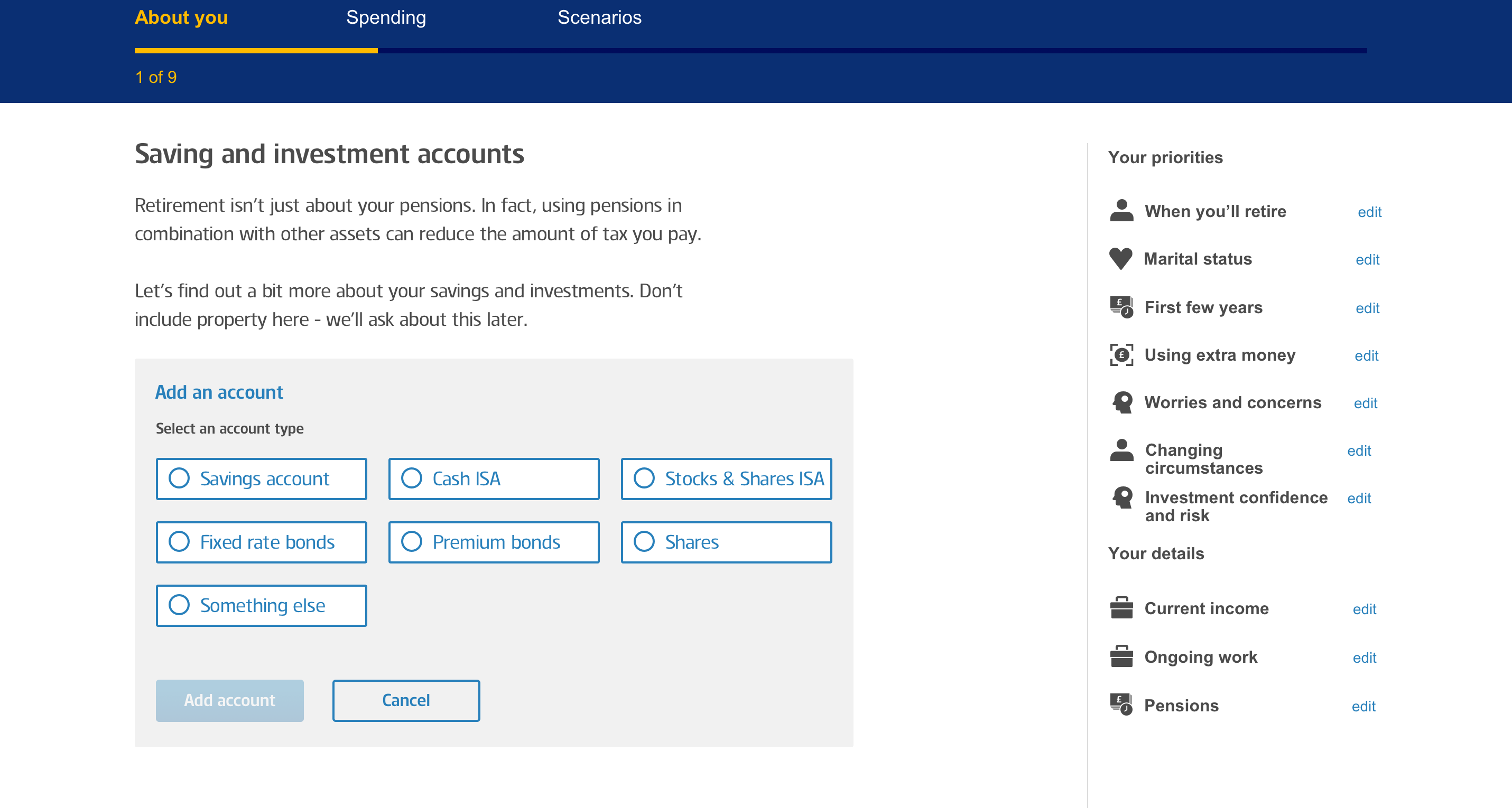
The table of assets below also proved to be a huge value point for customers, many of whom had never seen all of their assets in one place.